AI Tools that Help with Data Visualization

TL;DR
AI data visualization tools automate the grind of spotting patterns and building reports using natural language queries, predictive analytics, data discovery, and automated insights. This piece compares Tableau and Qlik Sense feature by feature, from Tableau's VizQL engine to Qlik's associative engine and no-code AutoML, plus pricing and free trials. It also flags Looker Studio and RapidMiner. The short version: Tableau suits large enterprises with heavy data needs, Qlik Sense fits teams leveling up from spreadsheets.
Have you ever found yourself staring at endless spreadsheets, struggling to find any patterns or anomalies? Are you tired of manually extracting and standardizing monthly reports for similar datasets?
Well, gone are the days when this task was yours alone. The latest Artificial Intelligence (AI) tools can now automate mundane tasks related to data visualization and extracting insights. Here is how AI-based data visualization tools can help:
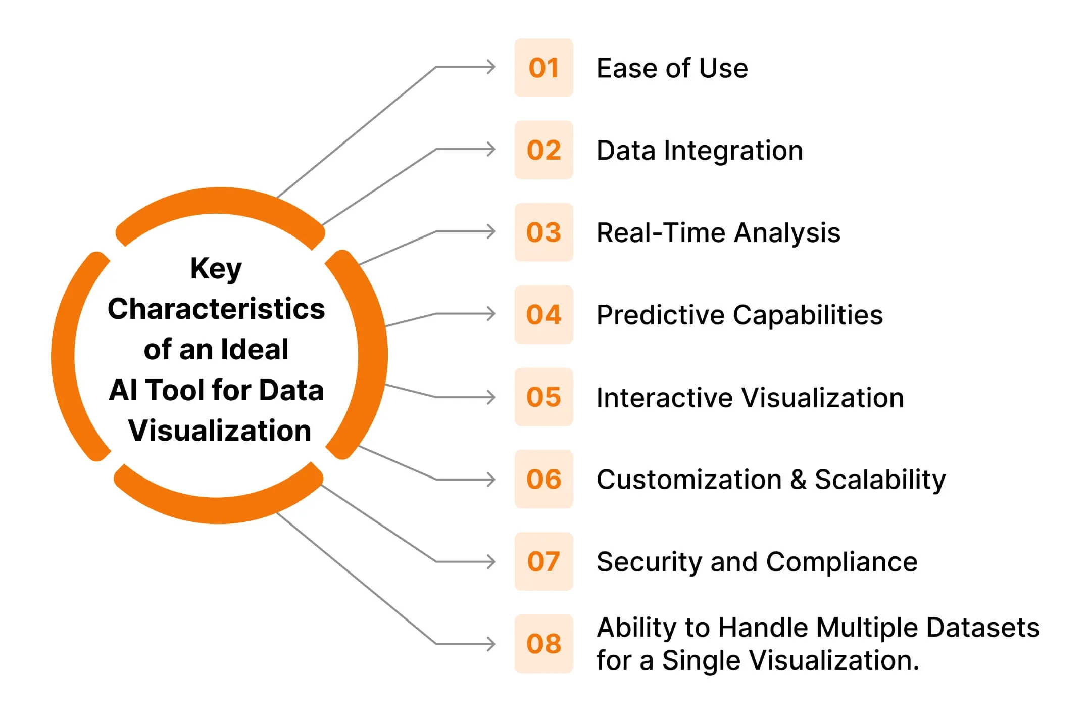
- Natural Language Processing (NLP): Allows users to interact with the platform as well as the datasets in natural language, making the platform more intuitive and enhancing user experience.
- Predictive analytics: Build AI models to communicate, forecast, and craft a story with graphs that could invariably help streamline operations, predict campaign outcomes, mitigate risks, and create refined marketing strategies.
- Data discovery: Uncover hidden patterns across all your datasets, creating a single view of all your data from various sources.
- Automated insights: Through AI and Machine Learning (ML), these tools can go deeper to analyze data trends and identify patterns, establishing all-encompassing reports.
AI tools for data visualization
The market offers a variety of robust solutions when it comes to AI tools that can elevate your data visualization game. We take a look at how two tools - Tableau and Qlik Sense - can help automate your data visualization workflow.
List of AI-driven features in Tableau and Qlik Sense
Features/Capabilities | Tableau | Qlik Sense |
|---|---|---|
Working architecture | Tableau works on its proprietary query language VizQL. It acts as an SQL query translator which effortlessly converts the traditional numerical SQL response into visual representations. | Qlik Sense uses associative technology that explores insights across all your datasets. This allows the tool to spot hidden patterns and insights that may be related to the query, providing a more nuanced analysis and data visualization. |
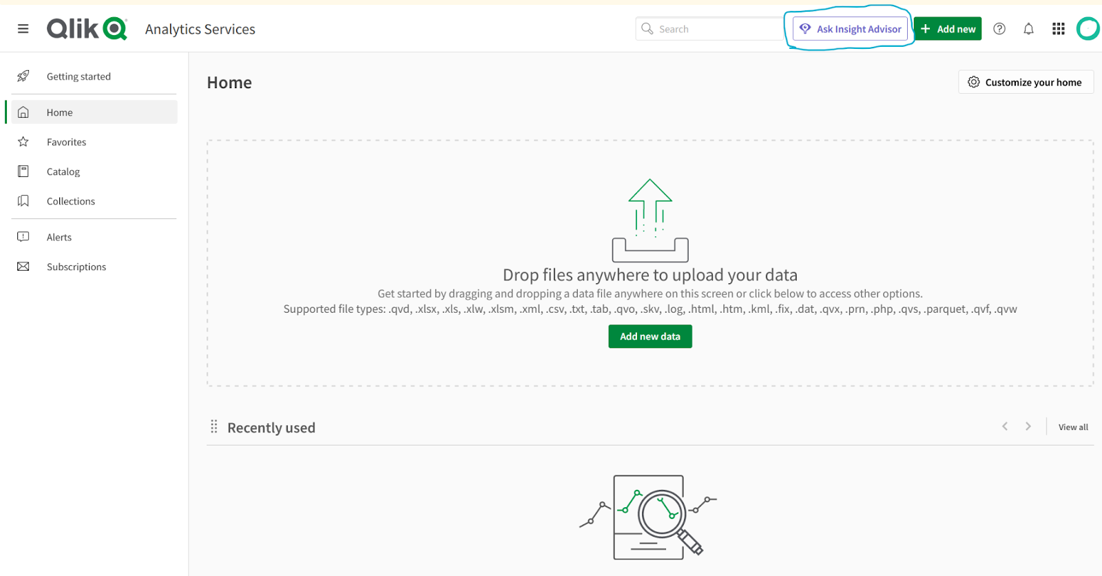
NLP power | “Ask Data” feature allows users to simply type in their questions and produce visual responses by leveraging NLP. | “Insight Advisor Chat” is a natural-language assistant that generates visualizations based on the user’s field selection and natural language search. |
Automated insights | “Explain Data” feature provides automatic statistical analysis of data points. It digs deeper into the data to analyze dashboards for finding correlations in the underlying data. | Qlik’s Cognitive Engine analyzes data by learning from it and automatically generates insights and suggests the best visualizations. |
Predictive analytics | Tableau’s predictive modeling uses linear regression for making predictions. | Qlik AutoML has in-built predictive analytics that doesn’t require coding, instead, they have a drag-and-drop interface for creating predictive models. |
Data cataloging | Tableau Catalog uses AI to manage metadata and ensure data quality. It can discover and index all your data which can be metadata, databases, or tables. | Qlik Catalog provides users with a single catalog for finding, analyzing, and gaining insights from their enterprise data source. |
Device compatibility | Available as a web application that can be viewed over a desktop, or tablet and even provides a mobile application for both Android and iOS. | Available as both web and mobile applications that can be viewed over a desktop, or tablet, and even on Android and iOS. |
Ease of integration | Tableau integrates better with advanced AI platforms like TensorFlow, Jupyter, and others for complex machine learning tasks. | Qlik's integration capabilities with platforms like Jupyter are comparatively limited to Tableau’s. |
Free trial? | Yes. 14 days | Yes. 30 days |
Pricing | - Starts from $15 per month per user and includes Tableau Cloud. - For Tableau Desktop, pricing starts from $70 per month per user. - Enterprise pricing is on request. | - $30 per month - Enterprise pricing is on request |
Overview of Tableau and its AI capabilities
Tableau is a powerhouse for data visualization. It leverages machine learning and statistical models to simplify data analysis and generate interactive, customizable visualizations.
Tableau promotes “data culture” by equipping every team in the enterprise with data-driven insights. It ensures the organization realizes the full potential of its data, helping solve any business challenges.
How does Tableau work?
Tableau can connect with your database over multiple sources and provide a single view. It can connect and extract data from sources like Excel sheets, Oracle or Salesforce databases, SQL, AWS, Google Cloud, and other popular data sources.
With this single view, it is easy to transform and shape data for modeling, where you can create dashboards, charts, and graphs for better visualizations. These are created using Tableau Desktop which can be shared locally over the server, or publicly as required.
During the process of creating reports, you can ask questions to which Tableau can provide analysis and recommendations for data visualization.
If you are just getting started with Tableau and data visualization, then you can start with exploring Tableau Public. It is a free platform to create and publicly share data visualization dashboards, and more. It also has a 14-day free trial for Tableau Desktop before you choose to commit.
Example of Tableau Dashboard
As an example, consider a performance marketer who wants to build a comprehensive social media dashboard. With Tableau, it is possible to build one such dashboard where data insights can be viewed over a date range.
Tableau comes with multiple data visualization and prediction charts which also include scatter plot, line plot, pie chart, bar chart, heatmaps, Gantt chart, boxplot, etc.
Image-1 shows the sample dashboard, with the carousel showcasing more examples of dashboards that can be built on Tableau. For more such public dashboards, you can explore Tableau Public.
Overview of Qlik and its AI capabilities
For analytics, Qlik started with QlikView which is their classic analytics solution. However, at the time of this article, they have an upgraded version called Qlik Sense - a modern analytics platform that is smarter and AI-driven.
Qlik Sense leverages AI capabilities to understand and transform data effectively. It minimizes cognitive biases and amplifies discovery elevating the data literacy of the user.
How does Qlik Sense work?
Qlik Sense works on Qlik’s associative engine which enables users to link and associate data from varied sources like AWS, Google Cloud, IBM DB, SQL, MongoDB, and more.
Qlik’s associative engine works differently from query-based languages. While in query-based language, search and analysis happen on data relevant to the query, Qlik’s associative engine allows users to explore the complete dataset for their selection and query input. This allows the visual reports to be intuitive and have deeper insights.
Qlik Sense has a 30-day free trial in which you can access all its tutorials. Even though you might not have access to all the apps for integration, it would be enough to browse around the platform and gauge if it suits your needs.
In case you get stuck anywhere, you can always get assistance from NLP-enabled “Ask Insight Advisor”.
Example of Qlik Sense Dashboard
Qlik Sense library has prebuilt automated templates that can be customized as per your needs. There are dashboard examples available in their tutorials, as well as their website. You can also watch these free demo videos to help you get started.
For more of such dashboards, have a look at the publicly available ones by Qlik here. You can play around these dashboards by changing filters and parameters in real-time and see the impact.
Our recommendation
Best data visualization tool for medium to large enterprise with high data needs: Tableau Best data visualization tool for those who want to level-up from Excel sheets or Google Data Studio: Qlik Sense
If you are a large enterprise that has data coming in from systems and applications by Oracle, Hadoop, or Salesforce, then Tableau should be your choice. While if you're a small to mid-sized enterprise with limited resources you can go for Qlik Sense.
Secondly, Qlik Sense prices start from $30 per month with full functionality, while for Tableau Cloud it is $15 per month. However, for the full functionality needed to build dashboards and work on reports, you need Tableau Desktop which starts at $70 per month for 1 user.
Hence, as far as pricing is concerned Qlik Sense is more affordable. However, always consider other factors like features, integration with existing systems, and the end objectives for using these tools.
Other options worth exploring - Looker Studio, RapidMiner
In addition to Tableau and Qlik Sense, there are other AI data visualization tools available in the market. To ensure that the chosen solution matches your business requirements, conduct a thorough needs analysis and tool evaluation before implementing.
Tableau | Qlik Sense | Looker Studio | RapidMiner | |
|---|---|---|---|---|
Description | Tableau is a pioneer in modern data visualization and self-service Business Intelligence (BI). It transforms the way you use data to solve problems. | Qlik Sense is a complete modern analytics solution that can tackle the most complex analytic challenges | Google Looker Studio is a browser-based data analytics tool that turns data into easy-to-read, informative dashboards and reports. | RapidMiner is an advanced analytics platform that uses machine learning and data integration to drive predictive insights. |
Architecture | Works on VizQL - a proprietary query language by Tableau that converts SQL queries’ numerical responses into visual representations. | Works on Qlik’s innovative Associative Technology that can draw relations between your datasets across all your data sources, providing you with a peripheral vision of your data. | Works on its version of query language called LookML with pre-built Looker Blocks. | It is an open-source platform, written in Java programming. |
Distinctive features | - Interactive dashboards. - Vast support network of the global community. - Integrates easily with most apps like Slack, SAP, AWS, and Salesforce. | - Associative modeling. - Data storytelling capability. - Enables passive to active analytics. | - Browser-based intelligence tool; no desktop installation required. - Its block architecture allows for reusable and modular components, making it a scalable solution. | - Comes with an integrated JupyterLab environment. |
Free trial? | Yes | Yes | Yes | Free demo on request |
Pricing | Starts from $15 per month per user and includes Tableau Cloud. For Tableau Desktop, pricing starts from $70 per month per user. For enterprise, pricing is on request. | $30 per month. Enterprise pricing on request | There is a free version of the tool. And a paid version, Looker Studio Pro | On request |
Popular clients (At time of writing) | Citigroup, Nike, The New York Times, Coca-Cola | Volvo, Elsevier, Sephora, Lenovo | CircleCI, Square, Typeform, DigitalOcean | Sony, Canon, BMW, Bloomberg |
Implementing a data visualization tool can be a valuable endeavor, but like any project, there are potential risks and costs that you should be aware of.
The initial investment can be substantial, encompassing not just the cost of the tools but potentially also hardware upgrades, additional software, and employee training. Successfully integrating AI tools with existing systems and their ability to scale with your business growth should be a critical deciding-factor.
Read more: Things You Should Know Before Implementing AI Tools in Your Data Visualization Workflow and Strategies
Which tool do you use for your data visualization needs? Let us know here.
Frequently Asked Questions
What do AI data visualization tools actually do that regular charting software doesn't?
They layer machine learning on top of the charts, so instead of you hunting for patterns, the tool surfaces them. Core capabilities include natural language querying (ask a question in plain English, get a visual back), predictive analytics for forecasting outcomes, data discovery that builds a single view across scattered sources, and automated insights that flag trends and correlations on their own. The point is offloading the mundane crunching so you spend time on decisions.
Tableau vs Qlik Sense: which one should I pick?
Pick Tableau if you are a medium-to-large enterprise pulling data from systems like Oracle, Hadoop, or Salesforce and you want deep integration with platforms like TensorFlow and Jupyter. Pick Qlik Sense if you are a smaller team leveling up from Excel or Looker Studio and want no-code predictive models via its drag-and-drop AutoML. Tableau leans on its VizQL engine, while Qlik's associative engine lets you explore the entire dataset rather than just query-relevant slices.
How much do Tableau and Qlik Sense cost?
Tableau Cloud still starts at $15 per user per month for a Viewer license, but building dashboards needs a higher tier (Explorer and Creator run more, and a Creator license is required per deployment). Qlik has moved new Qlik Cloud customers to capacity-based pricing, so the old flat $30-per-month figure is no longer how it is sold; you get a quote based on usage. For both tools, factor in training, integration, and scaling costs, not just the sticker price.
Can I try Tableau and Qlik Sense for free before committing?
Yes, both offer free trials. Qlik Cloud Analytics runs a full-feature 30-day trial that includes its tutorials. Tableau offers a 14-day free trial of Tableau Desktop, and you can also use Tableau Public for free to build and publicly share dashboards while you learn the ropes.
Does Tableau still use the 'Ask Data' and 'Explain Data' features for natural language?
Not under those names anymore. Tableau retired Ask Data and Metrics in Tableau Cloud in February 2024 (and in Tableau Server 2024.2), folding natural language querying into Tableau Pulse, its generative-AI insights layer. The conversational, build-me-a-viz assistant is now Tableau Agent (formerly Einstein Copilot). The underlying idea is the same as the original Ask Data: type a question, get a visualization, just rebuilt on newer generative AI.
Sources
- Tableau: Pricing (Tableau Cloud Viewer starts at $15/user/month)
- Qlik: Free full-feature 30-day Qlik Cloud Analytics trial
- Tableau Blog: Tableau Metrics and natural language query evolve with Tableau Pulse (Ask Data retired Feb 2024)
- Tableau Blog: What is Tableau Agent (formerly Einstein Copilot for Tableau)
- Tableau Help: Automatically Build Views with Ask Data (VizQL natural language background)
Keep reading
The archive →From The Cut
All takes →- The Best AI Voice Agents in 2026: What Actually Holds a Conversation
- The Best AI Voice Generators in 2026: What Actually Sounds Human
- The Best AI Website Builders in 2026: What Actually Ships a Site
- The Best MCP Servers in 2026: What's Actually Worth Connecting
- The Best Open-Source AI Agents in 2026: What's Worth Running
- The Best Tools to Run LLMs Locally in 2026